1. Lycored share nature’s wonder at Food Ingredients Europe in Paris
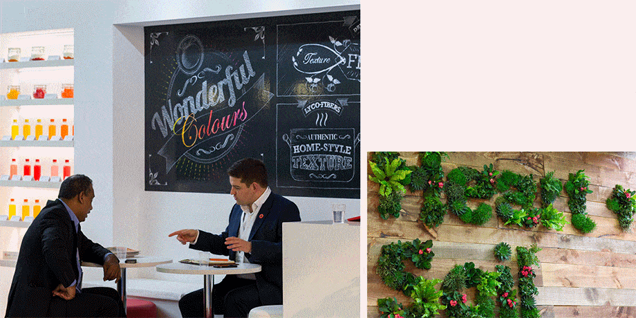
After working together on Vitafoods in May in Geneva, we helped Lycored, the Swiss-based real food ingredients company, bring their promise of “Sharing Nature’s Wonder” to Food Ingredients Europe in December in Paris. On a 50sq.m stand, fresh planting, natural wood, blackboard graphics created a lush and impactful space to meet press, customers and partners. The use of real plants and natural materials worked particularly well in the exhibition space, and helped bring the garden to kitchen concept to life. We also produced a set of colour system and real food ingredients collateral for the show.
The event came two weeks after the terrorist attacks in Paris, and the mood of FiE in early December was quietly resolute. A number of big exhibitors had made the decision to pull from the event, and there were some voids in the expanse of the Parc d’Exposition close to CDG Airport. For the 97% of exhibitors who did attend, once past the security gates, it was business as usual.
2. A new corporate website for the Carbery Group
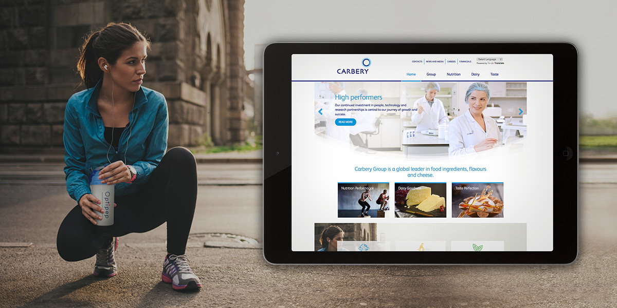
The Carbery Group is a secret success story from West Cork. Wholly owned by the farmers of four co-ops, it was established in 1961 and has grown organically and through acquisitions and joint ventures to be a respected, global player in dairy ingredients and flavours.
As part of our ongoing partnership with Carbery, this year we developed and launched a new corporate website designed to capture the diversity of the Carbery Group (nutritional ingredients, consumer foods, dairy ingredients and flavours) whilst presenting each unit as distinct offering. From ground zero we built a digital platform that met the needs of distinct user personas, with clear navigation and complex, technical information presented in a clean and easy to share manner. The impact has been seen through higher visitor numbers, better quality visits and more leads and interactions generated.
3. Razzle Dazzle Wexford Bus
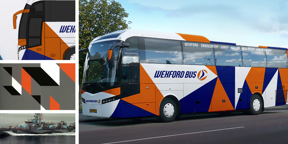
Swish swoo. You see the problem with most bus liveries is that they all look the same. A swirl here, a ribbon effect twist there; it’s all so identikit. So we were very happy to get a design carte blanche from the team at Wexford Bus to create new livery for their national fleet.
Back in 2009, Wexford Bus, as a plucky start up took on the big boys in public transport, and won. They have built a fantastic business that links the South East coast from Dublin to Waterford. With a free hand, we went anti-swish swoosh, and inspired by World War 1 razzle-dazzle battleships camouflage created an infinitely customisable, brutalist pattern that could be customised for any bus in their fleet, ensuring no two buses would be exactly the same – whilst all buses would be instantly recognisable. See more on our Behance page.
4. Quiet can be most powerful
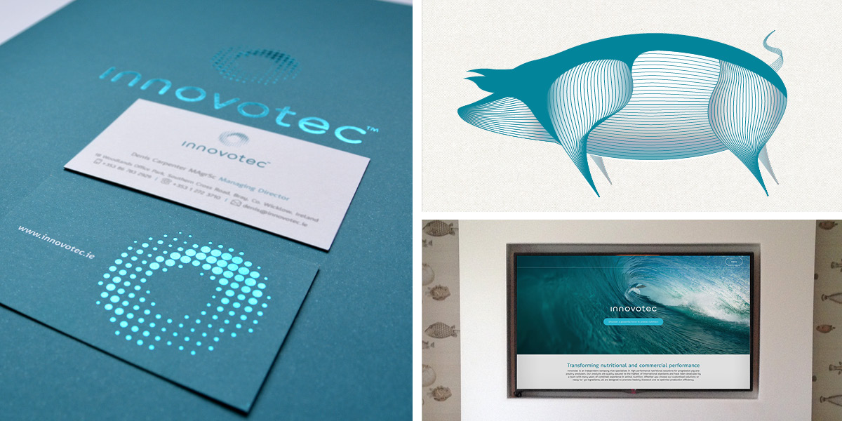
Some brands are like toddlers. They want attention and they want it now – they will be the brightest, the loudest, the centre of it all. But that’s not for everyone. Sometimes brand strength is about reinforcing the qualities of an existing reputation; locking in trust that’s already won and creating a strong and confident platform for sustainable business.
We wanted every element of the Innovotec brand to be powerfully understated. Beautiful material, perfect detailing in illustrations and data presentations, and confident messaging that never over-promises. Simply: a sought-after business in control of its own destiny.
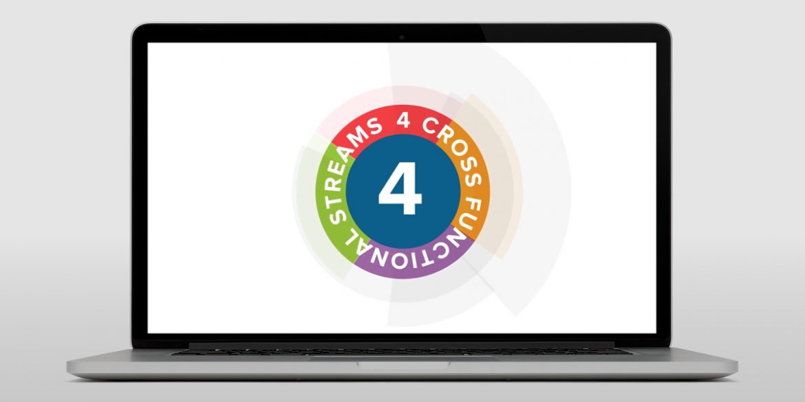
5. Supporting cultural change globally
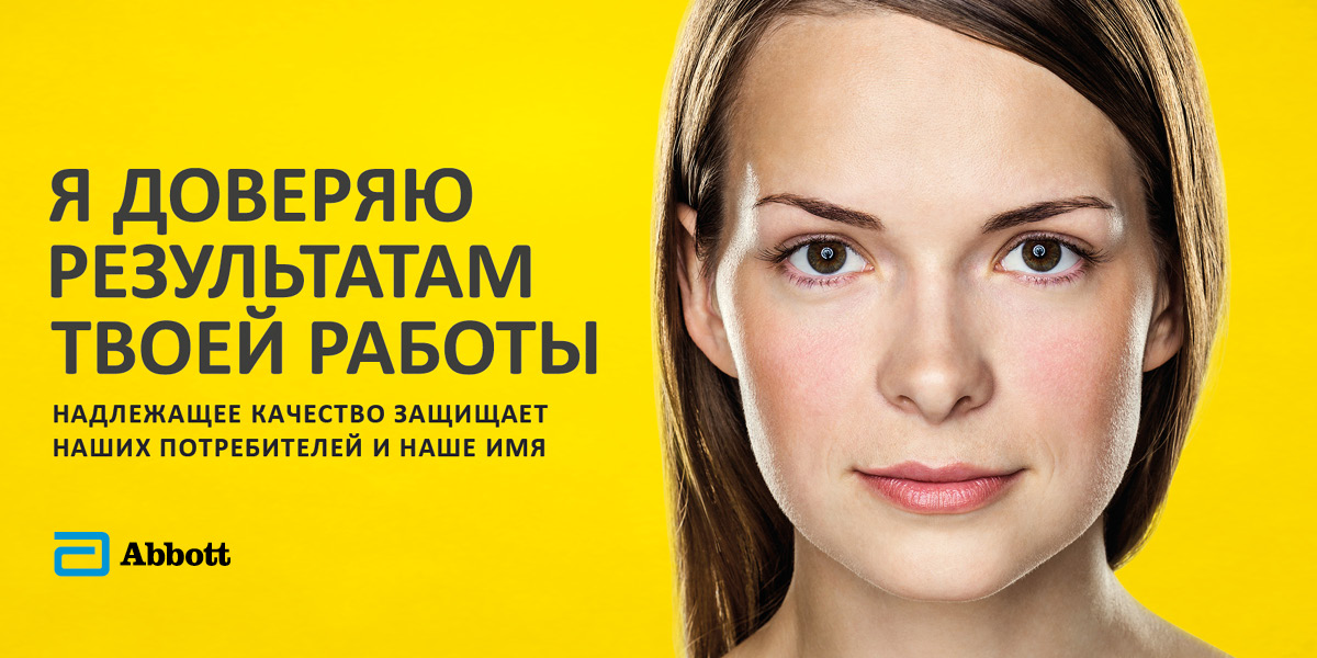
In an sector where quality is absolute; a culture of compliance is brand critical. We were appointed by a global pharmaceutical company to originate, create and deliver an internal communications campaign that worked across geographies, language and socio-demographics.
The focus of the solution was to use simple language, real people and positive colour impact to bring home the impact of quality on consumers all around the world. We rolled it out through site-takeovers, presentations, interactive learning session materials and merchandising. The impact? An increase in awareness and understanding of quality, and a significant increase in the uptake on training.
6. Putting CX at the heart of strategy
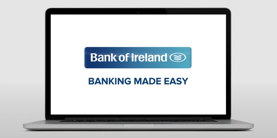
The link between customer experience, Net Promoter Score (NPS) and business growth is now well established.
Earlier this year, we helped Bank of Ireland’s Customer Experience (CX) team to communicate business wide the critical role that exceptional customer plays in their business strategy. Working closely with the CX team we refined and created a strong visual language for customer experience, that we rolled out business wide through animations, presentations and cool desktop merchandise.
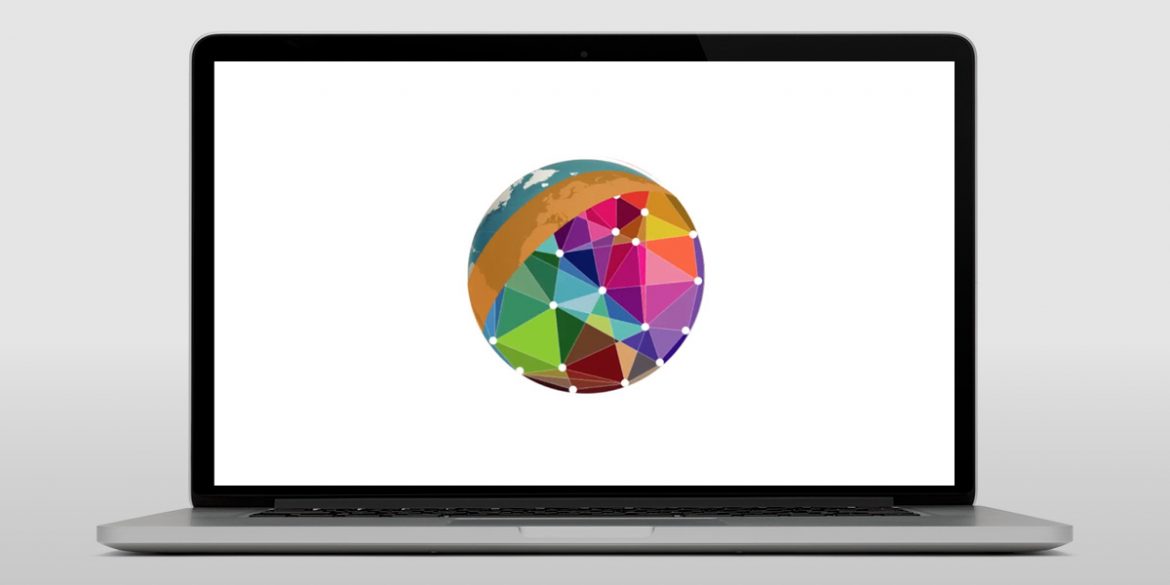
7. Inside out. Building a strong brand from within
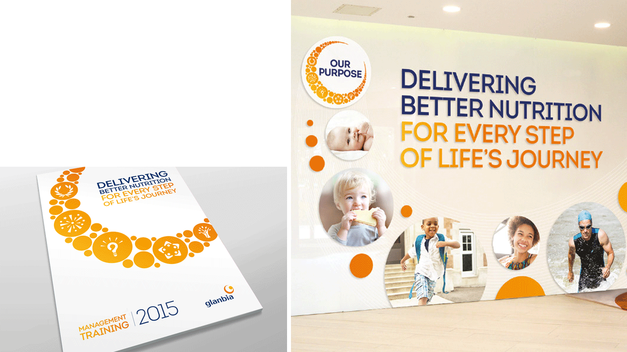
As Pixar taught us emphatically this year, it’s really what’s inside that counts. So when we were asked to by Glanbia PLC to visually articulate and communicate their strategic vision and purpose to all employees within the group, we looked for emotional engagement around those moments in life’s journey that have universal, and lasting significance. Moments that would resonate with the Group’s 5,600 global employees.
Bringing these moments together into a visual life line; we designed a logo-mark built around the core values that underpin Glanbia’s position as a successful, purpose-led global nutrition business. From there, we created a set of environmental graphics designed to embed the new vision and purpose in all of Glanbia’s global locations.
8. Getting city sharp
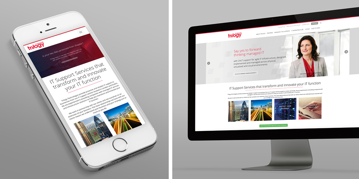
Trilogy Technologies, the Dublin headquartered IT support company asked us to transform their branding ahead of international expansion through acquisition. The company already had strong brand equity in Ireland, but were looking to define and articulate their offer in a way that would work in a city of London market. Through analytics, interviews, workshops and desk research we agreed a strong brand platform that built on their brand to date, and yet transformed the approach into something strong and compelling for both the Irish and UK markets. Our marketing strategy was to elevate the brand look and feel and create a brand that would engage powerfully across the c-suite, not just at IT management level.
From here, we designed a strong visual language and messaging, and got marketing and business development teams market-ready with fresh corporate presentations, company profile leave-behinds, a white paper and design and development of a corporate website.
9. A brave new world
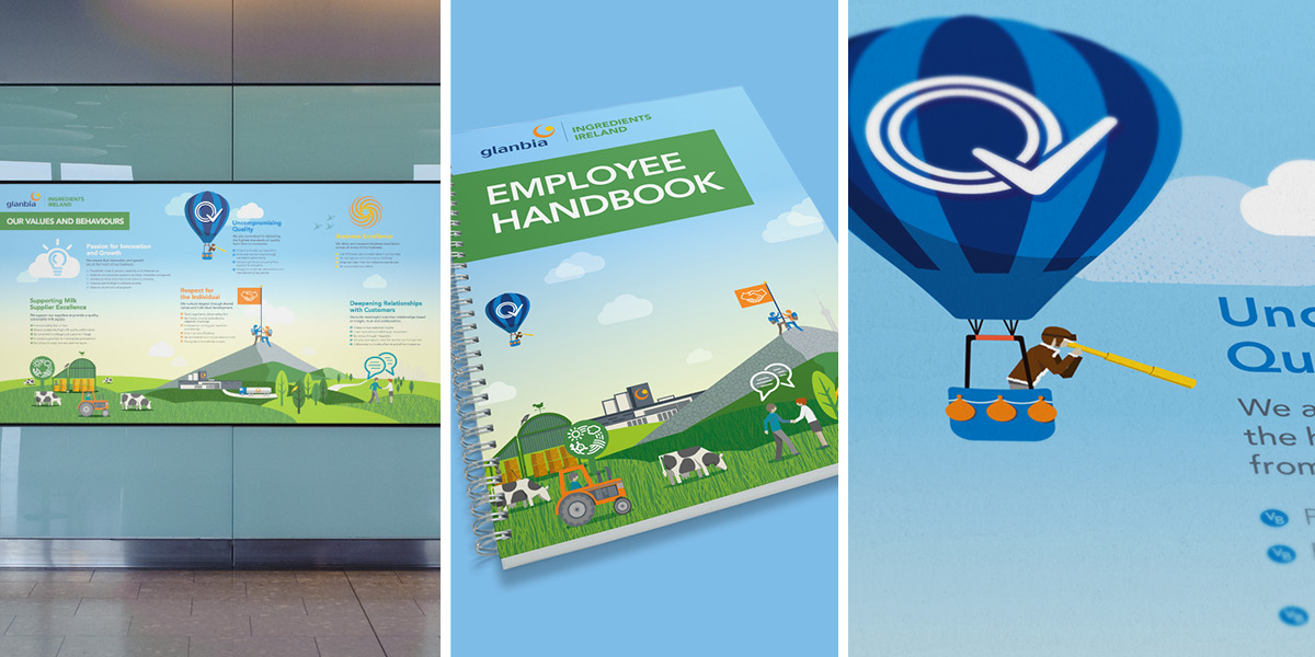
Glanbia Ingredients Ireland has decades of industry success and expertise, as Ireland’s leading dairy company, annually processing 1.8 billion litres of milk into a range of ingredients for export to more than 60 countries. 2015 was a significant year for the company with the opening of its Belview plant – the largest indigenous infrastructure investment by an Irish company in 80 years – as well as the abolition of the milk quota system in the EU. Threesixty is delighted to support GII with their internal and external marketing communications as they continue their success globally.
10. The little race with the big heart
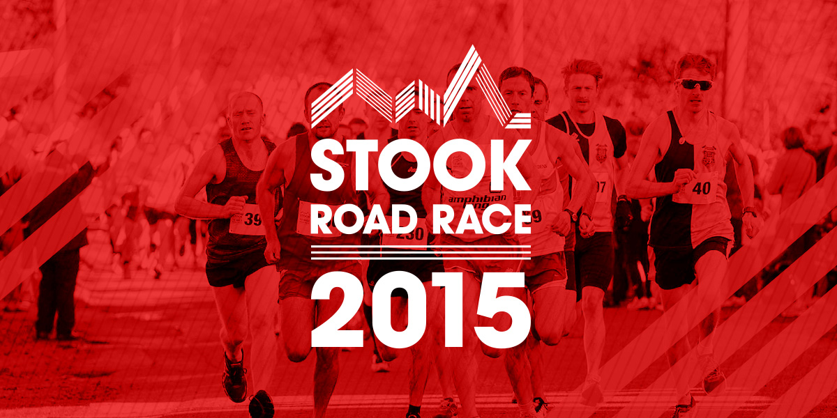
Stook, the name is synonymous with a high quality athletics club run race with a supremely tough elevation profile. Every year the village of Dungarvan in Co. Kilkenny welcomes 600+ runners to take part in this community fund-raising event. A pet project of Threesixty’s, we have built a visual identity and brand which celebrates the tough course and champions those who take part. This year we built a dedicated website for Stook – so if you’re looking for a challenge in 2016 (other than the Rio Olympics!) get in there.