
Bringing it all Back Home
It’s said that building the future and keeping the past alive are one and the same thing. Aspects of this reassuring concept shone through during our brand development and website build for kilkenny.ie.
The original Kilkenny logo, created through Threesixty (then ODM) in 1997, had served multiple stakeholders for almost a quarter of a century. It had become iconic, but its use had also become fragmented. This realisation presented our client, Kilkenny County Council, with an opportunity to bring it all back home to a single hero-place brand.
For this to work, the brand and the city would need to speak with authority and confidence to a diverse range of potential visitors, tourists and businesses. Our project driver from the outset was to create clarity around the Kilkenny brand and to focus attention on the city’s retailers, tourism and investment potential.
Something old, Something new
Kilkenny is a city of contrasts; a destination steeped in heritage and one bustling with modern tech companies and contemporary culture. Both past and present quickly emerged as our dual heroes. We embarked on a series of insightful engagements with a broad spectrum of stakeholders including leadership from the County Council and high profile businesses and organisations all of whom were interested in shaping the future of Kilkenny. From these, we garnered critical aspects of what is important about this place, but we also discovered there was far more going on in Kilkenny than we’d initially thought.
On the surface we had the obvious selling points, the city’s built heritage, how we experience and access this past, year-round festivals and a renowned crafts and creative arts scene. ButKilkenny also presented as an accessible future-looking destination and a city designed for people and day-to-day living. It has become a place where increased opportunities have emerged to create commercial and cultural clusters that attract new visitors and businesses from across financial, tech, agri-business, media, among others.
From a project view, it was vital to harmonise this juxtaposition of old and new, this place where heritage meets ambitious entrepreneurial energy, to show Kilkenny’s story as a confident and bold place to visit and locate – to build a future and keep the past alive.
ThreeSixty’s strategic and creative arms worked simultaneously from the start to build a universal message relevant to all stakeholders which could be transposed into a creative, living brand.
A Kit of Parts
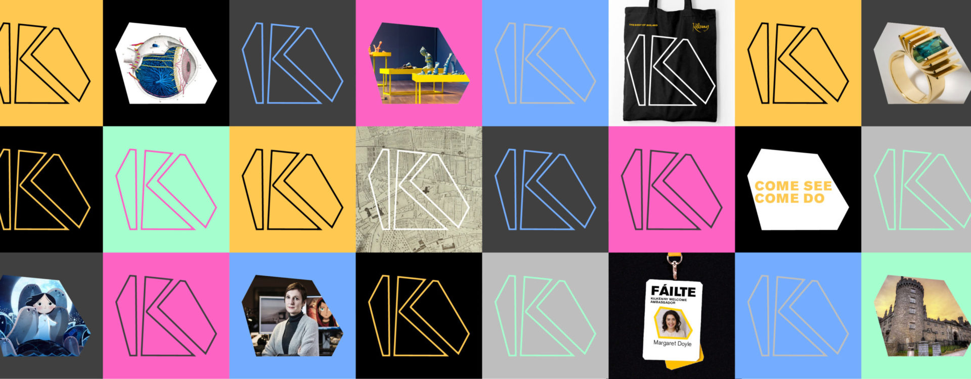
From a visual delivery perspective, we were very conscious of retaining the existing Kilkenny script and to build a new visual language around this legacy logo, giving it contemporary expression.
Using the strong K mark, we created a kit of graphic elements and built an angular, quite hard-edged shape system that contrasted with the original flowing typeface. The simplicity of this modular system of shapes is highly adaptable – at once representing Kilkenny’s streetscape while also positioning the diversity and potentials of the city.
The edginess at play was our way of tipping-a-hat to the Kilkenny Design Workshops founded here in the 1960s, keeping with many of the outputs from that era. For colour, we standardised, or as we like to think, reclaimed the county’s famous black and amber and underpinned these with a complementary pallet.
Come as you are
When it came to building a messaging model from our questionnaire insights, and one that adhered to the project’s ultimate goal of attracting more businesses and visitors, we built a framework around the concept of an invitation.
The idea of inviting people to come to Kilkenny delivered a simple call to action, inviting different groups and individuals to come; not just to see what Kilkenny has to offer, but to do the things they love to do while they are here.
Our invitation, Come See Come Do, proved highly versatile and one easily broken down depending on what area is being promoted by any one of the invested initiatives and interest groups; for example, festivals and culture would use Come See Come Together, for food we have Come See Come Taste, or for business, Come See Come Invest.
Using an invitation as visual messaging was initially challenging for some within the focus groups we presented to, but the client team clicked with it immediately and it’s proved a major communications asset in the rollout sense.
A Tale of two Cities
As part of our messaging model we also presented the client with two routes around positioning the brand and telling the story of Kilkenny. To start, we wanted to show the What of Kilkenny. This emerged as “The Medieval Heart of Ireland” and spoke of the intrinsic nature of the city – the “what we have” aspect, which revolves primarily around the built heritage.
We also wanted to present something more emotionally inviting and to challenge the initial thinking of the physical place. So, a second position grew from a need to bring something new and novel to the project. For this, we presented “The Best of Ireland”, which ultimately said that no matter what you come for, be it business or tourism, you will find it here in Kilkenny – it spoke to both businesses and tourism, and the reaction from stakeholders and focus groups was overwhelmingly; The Best of Ireland won through.
Since the project was handed over, both messaging and visual kit have been adopted and put to great use. It’s been an exciting and rewarding journey to watch Kilkenny embrace its bright future while celebrating its wonderful past.