Inconnection
Some background
Inconnection was created by Maeve after more than 25 years working across education, disability and healthcare. Through that experience, she repeatedly saw that many people who needed support couldn’t access it. Traditional therapy systems are often designed around one type of person and one way of engaging, and that doesn’t suit everyone.
She saw children and adults who felt unsafe or overwhelmed in typical therapy environments, parents who were exhausted from trying to make their child “fit the system”, and neurodivergent individuals who were misunderstood, overstimulated or overlooked.
Inconnection was built as a response to all of that. It was built around a different philosophy: the therapy adapts to the person. The focus was on creating a safe, flexible, and personalised support that meets people where they are, particularly for neurodivergent individuals and families who may not feel supported by more traditional approaches.
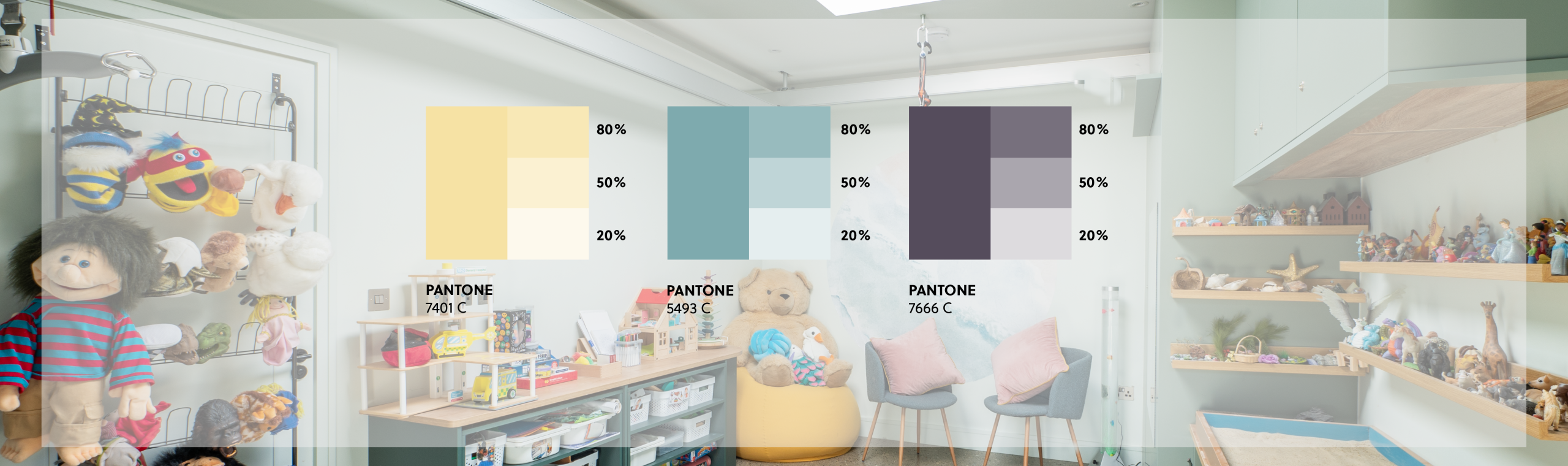
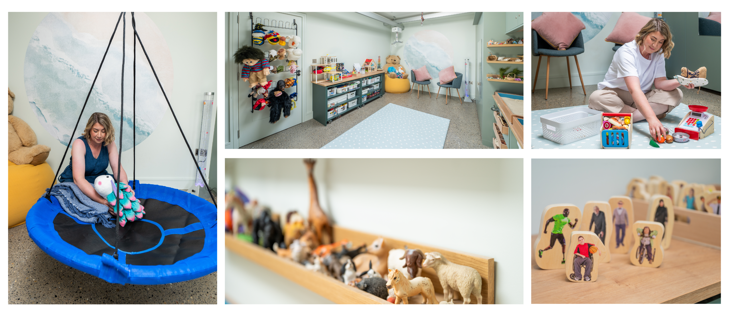
Maeve came to us with the name and the vision, but she needed a brand. What she did have was the physical therapy space ready that she had designed through her own research into which colours are most calming for a space where people have to feel comfortable and calm.
The assignment
Inconnection wasn’t trying to position itself as a typical therapy practice and it came to us with a very strong point of view centred around accessibility and genuinely adapting to each individual.
From a branding perspective, that created an opportunity to build something much more human and emotional than the standard clinical or wellness therapy brands you often see. There was also a chance to create a brand system that genuinely reflected accessibility principles, through clarity, flexibility, pacing and reduced the cognitive load.
The brief was to build a brand identity that reflected the way Maeveworks, one that communicated safety, adaptability and emotional warmth. The visual system had to be a direct expression from a different model of care.
The target audience includes children, teenagers, young adults and adults, with neurodivergent individuals and families at the centre of all thinking. This helped to shape the creative direction from the start: reduce cognitive load, calm layouts, generous spacing, clear typography and a flexible system that could adapt across different contexts and communication needs. Visual clutter and overly abstract symbolism were off the table because they increase overwhelm, and because they would have been dishonest to what the brand stands for.
Our Solution
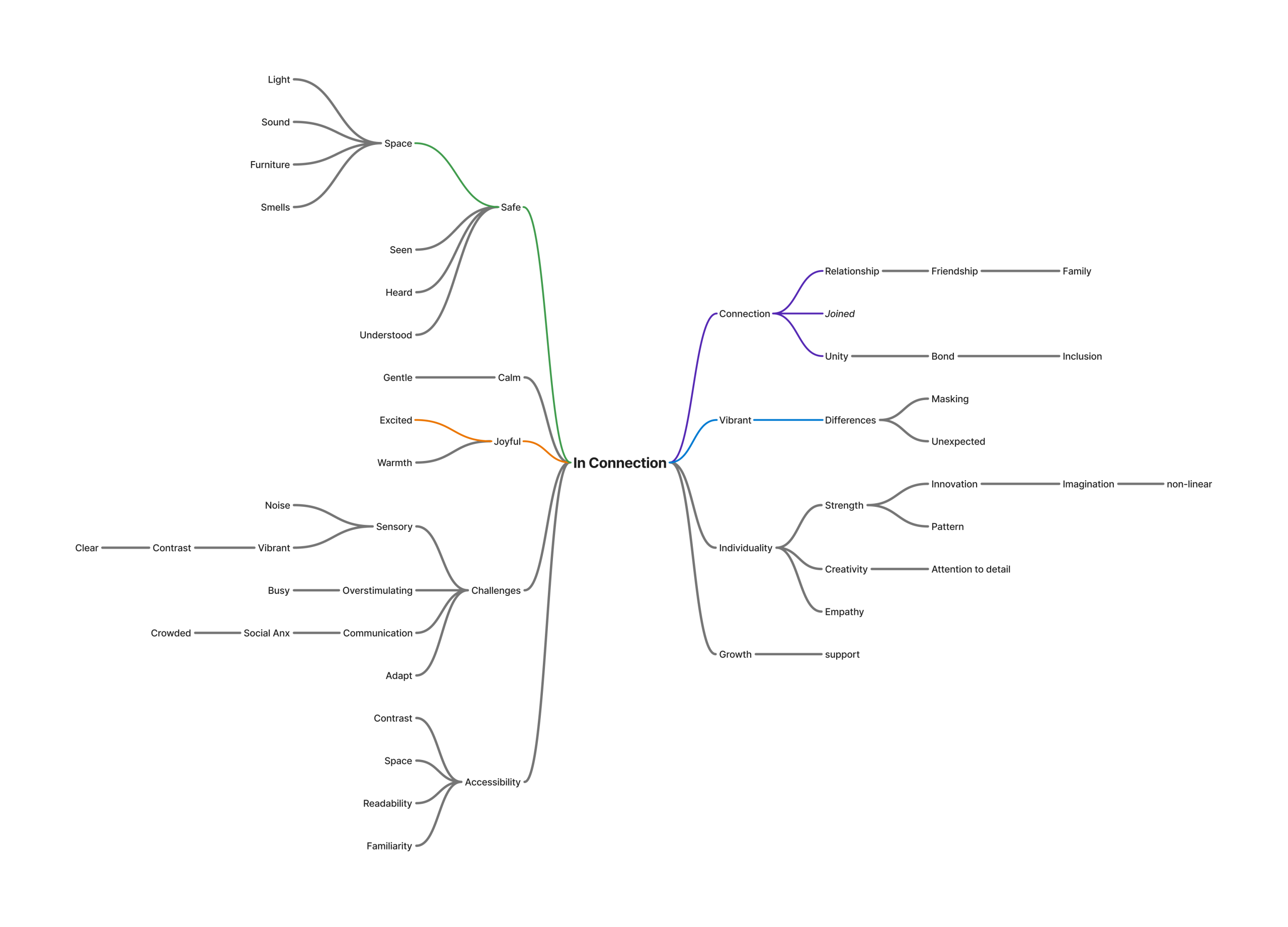
The process began with understanding. Before any visual work, the focus was on building a clear picture of Inconnection, its values, how it works, what it believes in and who it serves. Building a word map helped identify the 10 words that sit at the heart of the brand.
Logo
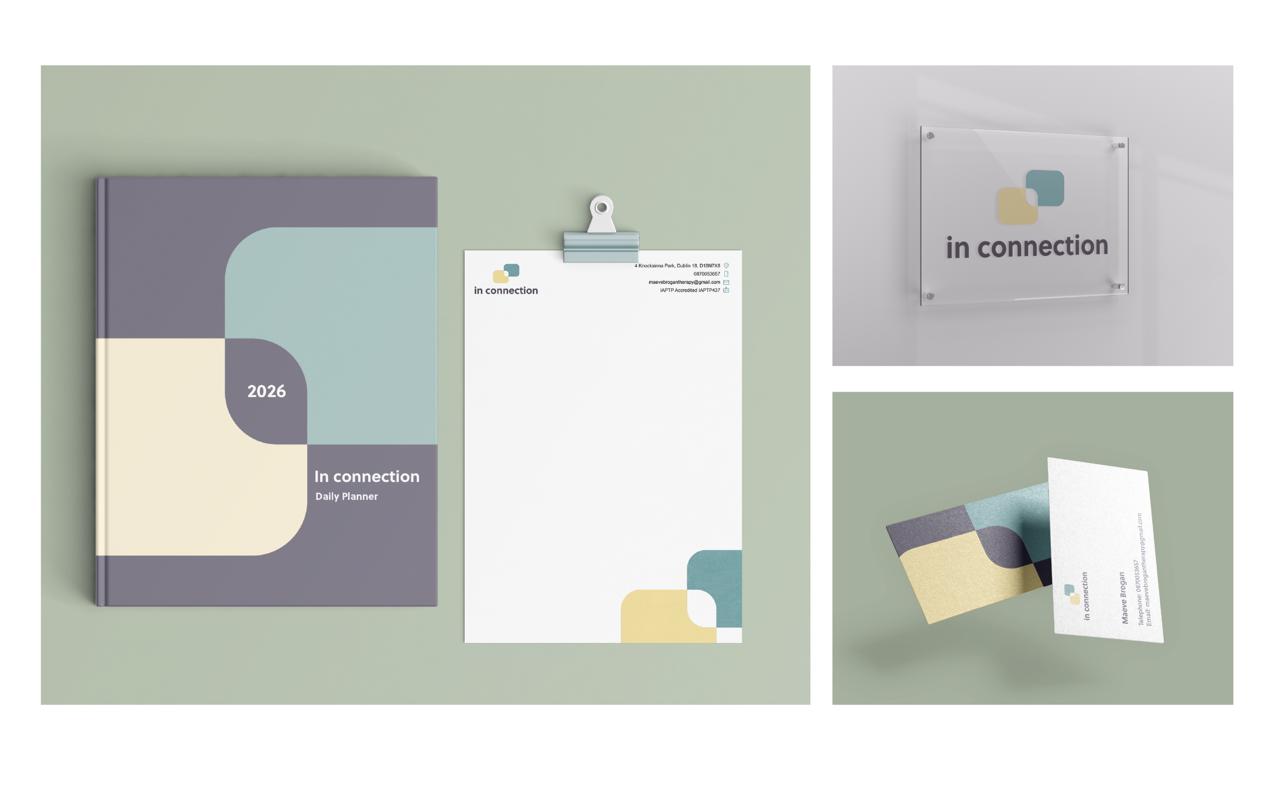
From there, the identity took shape. The logo is built from two squares interconnecting, simple, organic, soft. A mark that speaks directly to the connection between Maeve and the people she works with. The organic shapes carry through into the wider system too, appearing in presentation templates where they hold content side by side: text and image, or two blocks of text,… almost like a conversation happening on the page.

Typography & Colour Palette
Typography was chosen to mirror the brand’s character. Soleil was the right fit. For colours, we used a colour palette that was adapted to the colour that Maeve had chosen for the physical space.It is a core part of the practice and it was built to adapt to a person, help them grow and feel safe. Bringing them into the brand meant the identity and the space could speak the same language.
Visual elements
Throughout the process, every visual decision was held up against one question: does this serve the person, or is just noise? Decorative elements that didn’t earn their place were removed. The brand that emerged is simple, intuitive and consistent, which is exactly what reduces cognitive load and makes people feel safe.
One of the biggest challenges was to balance accessibility and creativity. Adhering to interaction design principles, such as user-centricity, learnability, accessibility and consistency helped to maintain that balance. It was important to reflect back on the brief and reevaluate some of the design decisions. Empathy played a major role in creating a brand identity for Inconnection.
Conclusion
The Inconnection brand identity is the result of applying real empathy to a design problem. Starting from a clear philosophy and a physical space full of intention, the identity that emerged reflects both, a calm, purposeful and built around the people it exists to serve.
Inconnection now has a visual language that is an essential part of the practice. The same care that went into designing the room, choosing the colours on the walls and building a model of support that adapts to every person, is now present in the brand.
Maeve’s words
“As a creative psychotherapist and play therapist who has always worked with marginalised people outside of the mainstream, I was initially daunted at the prospect of developing a brand, a website and all that goes with that.
What happened during my work with Deimante and Simon in Threesixty genuinely took me by surprise. As a neurodivergent therapist who cares deeply for my clients, I often have the burden of proof to support my clients to access the care they need. Mistakenly, I assumed that this may be part of this process. Instead, Simon and Deimante listened to my history and hopes for my clients, and approached this work with deep empathy and curiosity.
Each detail and step in connecting the needs and aspirations for my business was carefully constructed, always thinking about how this would work together to act as a safe place to land for my clients and families.
Both Simon and Deimante were enthusiastic and eager to learn from my personal and professional experiences, never shying away from difficult conversations about ableist language and constructs; and also seeking to ensure my clients experience was at the core of our work together.
I didn’t expect this experience to help me deepen my own belief in my work and my business, Simon and Deimante reflected back my passion and care and it was ultimately a process which helped me develop my confidence to broaden my vision for my business.
They developed the building blocks of accessibility and inclusivity into my brand: imagery, colour and beyond – but they also embedded a deeper humanity into their work. They listened to my story and responded with empathy and passion at every step.
I will always be grateful for this incredibly positive and enriching experience.
I am so excited to use this work to create a safe space for all of my clients and families and this sense of belonging and connection will start from the moment they connect with my brand which is so reflective of this core ethos.”
You might also like...
Migro
Migro — Digital Transformation Case Study High-growth Irish ecommerce business sees 7 x increase in turnover in 8 months “The…
Levelling Up eSports Nutrition – A Lead Generation Campaign
Synergy Flavours, is a global flavors business with established expertise and a reputation for developing on-trend flavors for sports nutrition…
Lycored
Brand guardians for Lycored a global all-natural wellness and food ingredients company.