A fresh brand identity and brand platform for The NextGen Group
The Client
In 2009, NextGen was formed in Dublin, Ireland to create an independent distribution pathway for disruptive technologies into Ireland’s enterprise landscape. Together with their reseller-partners, NextGen enable CIOs to deploy a new wave of game-changing technologies that protect and serve their businesses, enabling digital first to sit at the core of business strategy.
The Project Challenge
To rebrand, reposition and brand storytelling for NextGen as a the place where disruptive technology vendors and customer end-users meet.
The Strategy
Switched on
When the team at Threesixty first met the team at NextGen we were hugely impressed by the group of commercial experts and technologists with their fingers on the pulse of change.
The NextGen team were the heart and soul of the brand story we needed to tell as well as well as their offer to the market. Our work began with a series of management interviews, customer insight sessions and cross-functional internal workshops.
Our research and insight provided a clear platform for the re-positioning of NextGen based upon a newly defined and articulated brand story which was being poorly communicated to their reseller-partners.
The Design Solution
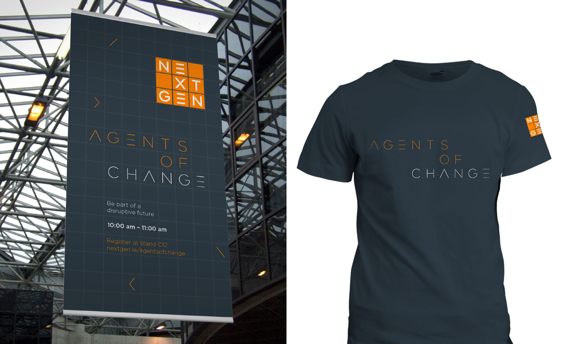
Agents of Change
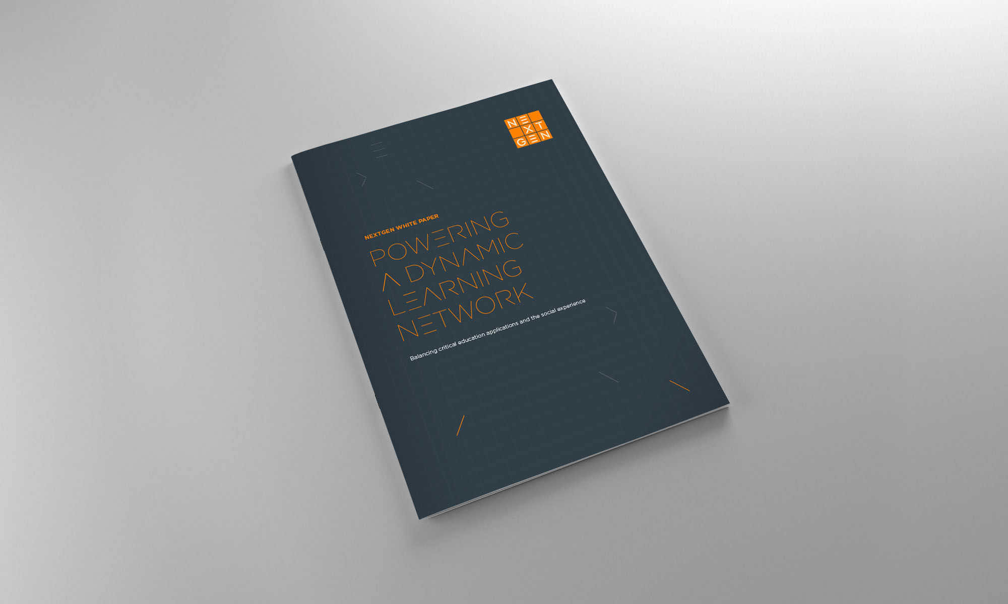
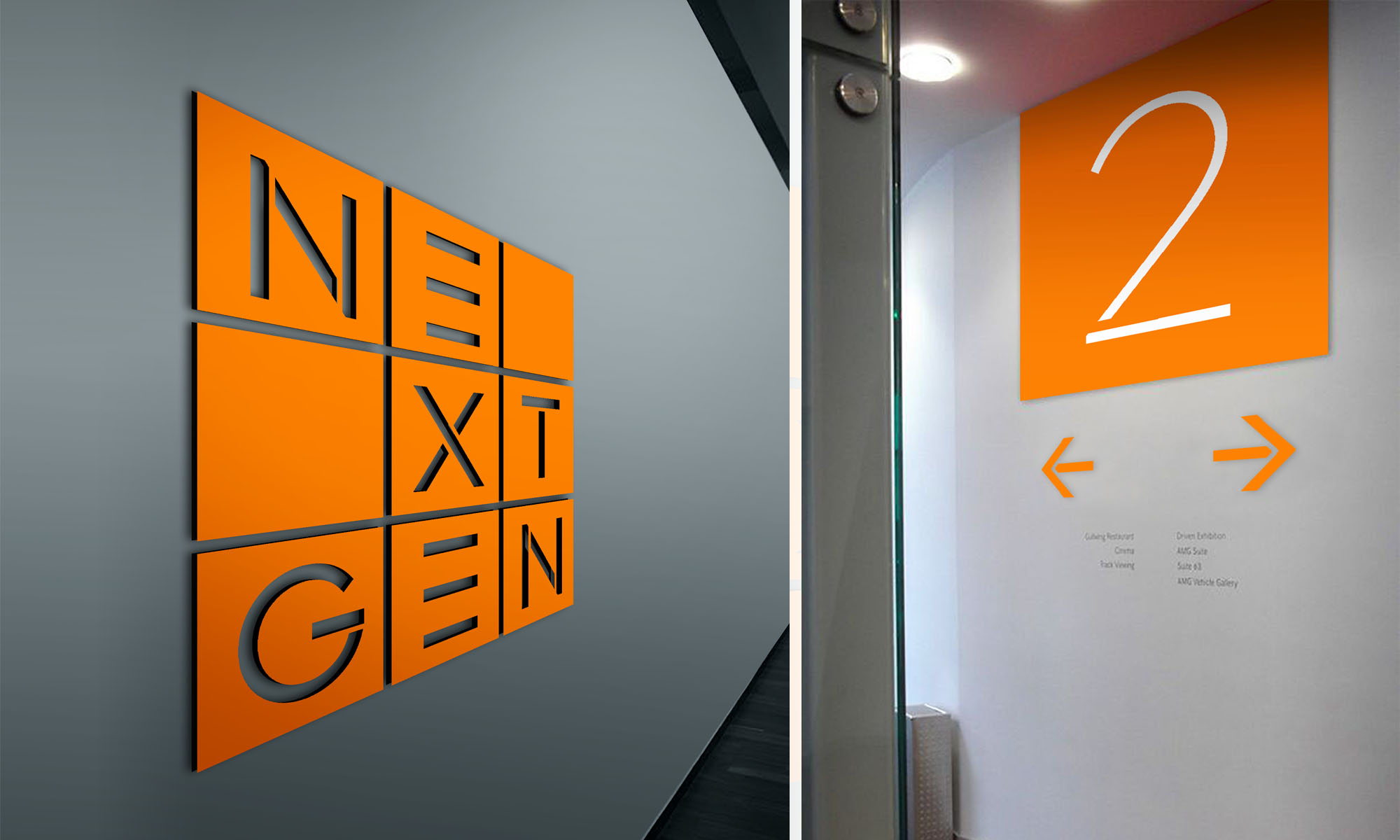
‘Sleeves rolled up, relentlessly igniting and fuelling commercial performance for our vendors and our reseller-partners’ is one of the core brand values we established. This was also our approach to the design challenge. We started at the beginning and designed a new brand identity system that incorporated a new logo, supporting visuals, graphics and messaging guidelines.
The logo mark has the idea of change is at the centre of the identity. Visually bold and striking with an intelligent visual language that rolls out to a range of applications. The identity requires some interaction and thought and is based on a grid which gives a bold and strong structure. Using a sharp, minimalist type-style, the NextGen name is deconstructed using a customised typeface. The identity gives NextGen a new dimension allowing itself to be visual strong but also intriguing. It uses a sharp, minimalist type-style that ties in with the concept of NextGen being ‘Agents of Change’.
The colour palette is bright and modern, the typefaces are technical and strong – all of which is designed to be much more reflective of the tech world. We designed a set of launch applications, messaging and the style guides for their website
The Impact
The new positioning breathed life immediately back into the whole company. The brand colours deliberately integrate with the tech world as the dynamic orange emphasises NextGen’s passion to empower its reseller-partners and their ambitions as well as their own independent and entrepreneurial spirit.
You might also like...
Lycored
Brand guardians for Lycored a global all-natural wellness and food ingredients company.
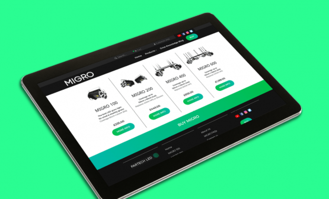
Migro
Migro — Digital Transformation Case Study High-growth Irish ecommerce business sees 7 x increase in turnover in 8 months “The…

Levelling Up eSports Nutrition – A Lead Generation Campaign
Synergy Flavours, is a global flavors business with established expertise and a reputation for developing on-trend flavors for sports nutrition…